Mobile users expect websites to load quickly. If a page takes too long to appear, many visitors leave before they even see your content. One of the biggest reasons for slow-loading pages is large, unoptimized images.
Learning how to optimize images for mobile devices is no longer optional. It is an essential part of modern website performance, user experience, and search engine optimization. When images are properly optimized, pages load faster, users stay longer, and websites perform better in search results.
It is common to see websites that look stunning on desktop devices but feel sluggish on smartphones. In many cases, oversized image files are the culprit, consuming bandwidth, slowing page speed, and creating unnecessary friction for visitors.
After optimizing the images, loading times improved dramatically, and user engagement increased.
In this guide, you learn practical techniques to optimize images for mobile devices, improve website speed, enhance visual quality, and create a better experience for your audience.
Why Mobile Image Optimization Matters
Today, mobile traffic accounts for a significant portion of internet usage. People browse websites while commuting, shopping, traveling, and relaxing at home. Not everyone has access to high-speed internet connections all the time.
Large image files can create several problems:
- Slow page loading times.
- Increased mobile data usage.
- Higher bounce rates.
- Poor user experience.
- Lower search engine rankings.
If your goal is to optimize images for mobile devices, reducing file size while maintaining image quality should be a top priority. Even small improvements can make a noticeable difference in how quickly pages load on smartphones and tablets.
Search engines increasingly focus on user experience signals. Faster websites often have an advantage because they provide a smoother browsing experience.
When you optimize images for mobile devices correctly, visitors can view your content faster without sacrificing image quality.
10 Best Strategies to Optimize Images for Mobile Devices
Resize Images Before Uploading

One of the most common mistakes website owners make is uploading images directly from a camera or smartphone.
Modern cameras often produce images that are 4000 pixels wide or larger. Most mobile devices never display images at those dimensions.
For example, an image displayed at 600 pixels wide does not need to be uploaded at 4000 pixels wide.
Before uploading an image, resize it to match its intended display size. This simple step can reduce file sizes dramatically while maintaining excellent visual quality.
Think of it like carrying a backpack. If you only need a few items, there is no reason to carry unnecessary weight.
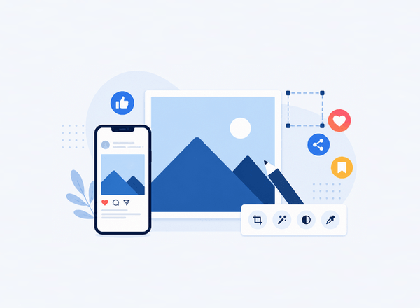
Choose the Right Image Format
Selecting the proper format is one of the simplest ways to optimize images for mobile devices. Modern formats such as WebP and AVIF can significantly reduce file sizes compared to traditional formats while preserving excellent visual quality.
JPEG: JPEG remains a solid choice for photographs and complex images. It balances quality and file size effectively.
PNG: PNG is ideal for graphics that require transparency. However, PNG files are often larger than alternative formats.
WebP: WebP offers excellent compression while maintaining high visual quality. In many cases, WebP images are significantly smaller than JPEG and PNG files.
AVIF:AVIF is one of the newest image formats available. It provides impressive image quality at remarkably small file sizes. Many modern websites now use AVIF to maximize performance.
So if you want to optimize images for mobile devices, WebP and AVIF are often the strongest options.
Compress Images Without Losing Quality

Image compression removes unnecessary data from image files. The goal is to reduce file size while preserving visual appearance.
Many people worry that compression will make images look blurry. In reality, properly compressed images often appear nearly identical to the original versions.
There are two main types of compression:
Lossless Compression: Lossless compression reduces file size without removing visible image information.
Lossy Compression: Lossy compression removes some image data to achieve even smaller file sizes.
For most websites, moderate lossy compression delivers the best balance between image quality and performance.
A good rule is simple: if visitors cannot see the difference, the smaller file size wins.
Use Responsive Images
Responsive images are a key component of any strategy to optimize images for mobile devices because they ensure users receive image sizes that match their screens instead of downloading unnecessarily large files.
Not every visitor uses the same screen size.
A large tablet, a small smartphone, and a desktop monitor all require different image dimensions.
Responsive images allow browsers to select the most appropriate image version for each device.
Instead of serving a large image to every visitor, responsive design delivers a version tailored to the user’s screen.
Benefits include:
- Faster loading times.
- Reduced bandwidth usage.
- Better mobile performance.
- Improved user experience.
Responsive images are one of the most effective techniques available for mobile optimization.
Implement Lazy Loading

Imagine a page containing twenty images.
When a visitor opens the page, only a few images are visible initially. The remaining images appear farther down the page.
Without lazy loading, every image loads immediately.
With lazy loading, images load only when users scroll near them.
This technique reduces initial page weight and improves perceived loading speed.
Many modern content management systems now support lazy loading by default, making implementation much easier than in the past.
Visual: Traditional Loading vs Lazy Loading
- Without Lazy Loading: All images load immediately.
- With Lazy Loading: Only visible images load first.
Result: Faster page rendering and improved mobile performance.
Serve Images Through a CDN
A Content Delivery Network stores copies of website assets across multiple geographic locations.
When users visit your website, images are delivered from a server closer to their location.
This reduces latency and improves loading speed.
CDNs are particularly valuable for websites with international audiences because they help deliver content efficiently across different regions.
For image-heavy websites, the performance improvements can be substantial.
Optimize Images for Core Web Vitals
Google’s Core Web Vitals measure important aspects of website user experience.
Images have a direct impact on these performance metrics.
Large image files can slow down loading speed and negatively affect performance scores.
Optimized images help improve:
Largest Contentful Paint (LCP) is a Core Web Vital that measures how long it takes for the largest visible element on a webpage—such as an image, banner, or large block of text—to fully load.
A faster LCP helps create a better user experience by allowing visitors to see the main content quickly. Google recommends an LCP score of 2.5 seconds or less for optimal website performance.
Cumulative Layout Shift (CLS) is a Core Web Vital that measures the visual stability of a webpage while it loads. It tracks unexpected movements of content, such as text, images, or buttons shifting position after the page begins to appear.
A low CLS score helps create a smoother user experience by preventing accidental clicks and frustrating layout changes. Google recommends a CLS score of 0.1 or lower for good website performance.
Overall Page Responsiveness refers to how quickly a webpage responds to user interactions, such as clicking buttons, tapping links, or entering text into forms. A responsive website reacts almost instantly to user actions, creating a smooth and enjoyable browsing experience.
Improving page responsiveness often involves optimizing images, reducing unnecessary code, and minimizing delays caused by heavy scripts, helping visitors interact with your site without frustration.
When images load efficiently and maintain consistent dimensions, websites perform better for both users and search engines.
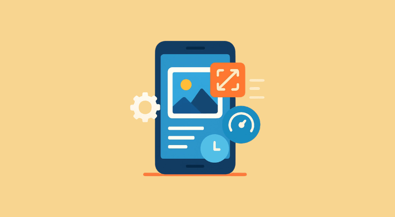
Avoid Using Images Larger Than Necessary
A common misconception is that larger images always look better.
In reality, oversized images often provide little visual benefit while creating significant performance problems.
For most mobile displays, moderate image dimensions are more than sufficient.
Before uploading an image, ask yourself:
“Will users actually see the extra detail?”
If the answer is no, reducing dimensions can provide substantial performance gains.
Many visitors browse websites on smaller smartphone screens, where ultra-high-resolution images offer little noticeable improvement.
By using appropriately sized images, you can significantly reduce file sizes, speed up page loading times, and create a smoother browsing experience.
This simple adjustment is one of the easiest ways to optimize images for mobile devices without sacrificing visual quality.
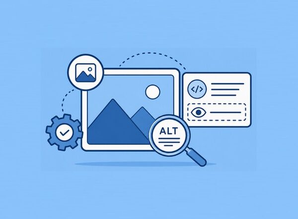
Optimize Alt Text for Accessibility and SEO

Image optimization is not only about file size.
Every image should include descriptive alt text.
Alt text serves several purposes:
- Improves accessibility.
- Helps screen readers describe images.
- Provides context if images fail to load.
- Supports image SEO.
For example:
Bad alt text:
“image1”
Better alt text:
“Mobile user browsing a fast-loading ecommerce website”
Keep descriptions clear, concise, and relevant to the image if you want to optimize images for mobile devices.
Monitor and Test Image Performance Regularly
As websites grow, new images are constantly added. Even if your site is fully optimized today, future uploads can gradually impact performance if they are not properly compressed and resized.
Regular performance testing helps identify opportunities for improvement and ensures your images continue to support a fast, mobile-friendly experience. It can also reveal issues before they begin affecting user engagement and search rankings.
Monitor:
- Page speed.
- Image sizes.
- Mobile performance scores.
- Loading times.
Tools such as Google PageSpeed Insights and Lighthouse can help pinpoint images that may be slowing down your site.
Small improvements accumulated over time can create significant gains, leading to faster loading pages, better user experiences, and stronger SEO performance.
How PixWizify Can Help
If you are looking for practical ways to optimize images for mobile devices, improve image quality, and stay current with modern image formats, PixWizify is an excellent resource to explore.
Keeping up with changing image standards can be challenging. Platforms like PixWizify help website owners, bloggers, designers, and marketers stay informed about the latest techniques for improving image performance while maintaining visual quality.
Common Mobile Image Optimization Mistakes
Many website owners unknowingly make mistakes that hurt performance.
The most frequent issues include uploading original camera images, skipping compression, ignoring responsive images, and relying on outdated formats.
Another common problem is focusing only on visual appearance while overlooking loading speed.
A beautiful image loses much of its value if visitors leave before it appears on the screen.
The best approach balances visual quality with performance.
It’s important to remember that users care about both appearance and speed. An image that looks great but takes several seconds to load can negatively impact the overall browsing experience.
Even small delays can increase bounce rates and reduce user engagement.
Taking a few extra minutes to resize, compress, and properly format images can make a noticeable difference.
By avoiding these common mistakes, website owners can improve page speed, enhance mobile usability, and create a smoother experience for visitors across all devices.
Frequently Asked Questions About How to Optimize Images for Mobile Devices
Why is it important to optimize images for mobile devices?
Mobile users expect fast-loading pages. Large image files can slow down a website, increase data usage, and create a poor user experience. When you optimize images for mobile devices, pages load faster and visitors are more likely to stay on your site.
Which image format is best for mobile devices?
WebP and AVIF are among the best formats for mobile optimization because they offer excellent image quality at smaller file sizes. JPEG is still a good choice for photographs, while PNG works well for graphics that require transparency.
How much should I compress images?
The ideal compression level depends on the image and its purpose. In most cases, moderate compression can significantly reduce file size while keeping images visually appealing. Always preview images after compression to ensure quality remains high.
Does image optimization improve SEO?
Yes. Image optimization can improve page speed, user experience, and Core Web Vitals, all of which can contribute to better search engine rankings. Optimized images can also help image search visibility when paired with descriptive alt text.
What tools can help optimize images for mobile devices?
Popular tools include Google PageSpeed Insights, Lighthouse, TinyPNG, Squoosh, ImageOptim, and various WordPress image optimization plugins. Resources like PixWizify can also help you learn new image optimization techniques and stay updated on modern image formats.
Final Thoughts
Implementing these 10 powerful strategies to optimize images for mobile devices can dramatically improve website performance, user satisfaction, and search visibility.
The process does not require advanced technical knowledge. Start by resizing images, compressing files, choosing modern formats like WebP or AVIF, implementing responsive images, and enabling lazy loading.
Each improvement may seem small on its own, but together they create a faster and more enjoyable experience for mobile visitors.
As mobile browsing continues to dominate internet usage, image optimization remains one of the most effective ways to boost website performance. Invest time in optimizing your images today, and your visitors—and search engines—will appreciate the results.