Scroll through any social feed today, and one thing becomes clear fast—social media images drive attention.
People do not stop for text alone anymore. They pause for visuals that feel bold, clear, and emotionally engaging.
A strong image can stop the scroll in less than a second and dramatically boost engagement across platforms like Instagram, Facebook, LinkedIn, Pinterest, and X.
Research shows that content with relevant images gets up to 94% more views than content without visuals. On Facebook, posts with images receive 2.3x more engagement compared to text-only posts (BuzzSumo).
This is why learning how to create better social media images is no longer optional. It is a core skill in modern digital marketing, branding, and content creation.
In our guide, you will learn 20 proven strategies to design social media images that actually boost engagement, improve clicks, and strengthen your brand presence.
Why Great Social Media Images Matter
Every day, people scroll through hundreds of posts. Most receive little more than a glance before disappearing into an endless feed.
A compelling image interrupts that scrolling habit.
Humans process visual information much faster than text, making images one of the most powerful communication tools available. A well-designed graphic quickly tells a story, sparks curiosity, and encourages people to learn more.
Better visuals can help you:
- Increase likes and reactions.
- Generate more comments.
- Encourage shares.
- Improve click-through rates.
- Strengthen brand recognition.
- Increase website traffic.
- Build trust with your audience.
Simply put, stronger social media images often lead to stronger marketing results.
20 Proven Tips to Boost Engagement With Social Media Images
Understand Your Audience First
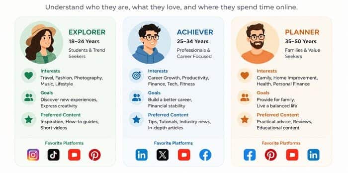
Before you design anything, you need to understand who you are speaking to.
Social media images for teenagers on TikTok look very different from those designed for business professionals on LinkedIn.
Ask yourself:
- Who is my ideal audience?
- What problems are they trying to solve?
- What catches their attention?
- What style fits their interests?
For example, a finance company usually benefits from clean layouts, professional colors, and informative graphics. A travel blogger can use vibrant landscapes and adventurous photography. A bakery may focus on warm colors and close-up food photography that makes viewers hungry.
Practical Tip: Create a simple audience profile that includes:
- Age range.
- Interests.
- Favorite social platforms.
- Common challenges.
- Visual preferences.
This profile becomes your design guide for every future post.
Use Clear Visual Hierarchy
Visual hierarchy means guiding the viewer’s eye in the right order.
Strong social media images should lead the viewer like this:
- Headline or main hook.
- Supporting visual.
- Call-to-action or branding.
To achieve this:
- Use larger fonts for key messages.
- Keep secondary text smaller.
- Use spacing to avoid clutter.
A clean hierarchy makes your content easier to understand in under 2 seconds.
Build a Consistent Brand Identity
Imagine seeing a post online and instantly recognizing the company before reading a single word.
That is the power of consistent branding.
Using the same colors, fonts, and design style across every post helps people become familiar with your content. Over time, this builds trust and recognition.
Your brand identity should include:
- A consistent color palette.
- One or two font families.
- Logo placement.
- Graphic style.
- Photo editing style.
- Icon style.
According to Marq (formerly Lucidpress), consistent branding can increase revenue by up to 23%, showing that visual consistency has a real business impact.
Choose the Right Image Dimensions
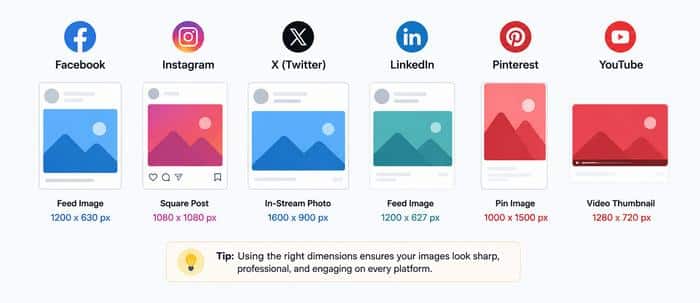
Each platform has its own ideal size. Using the wrong format reduces quality and visibility.
Here are the most important ones:
- Instagram post: 1080 × 1080 px
- Instagram story: 1080 × 1920 px
- Facebook post: 1200 × 630 px
- X (Twitter) image: 1600 × 900 px
- LinkedIn post: 1200 × 1200 px
- Pinterest pin: 1000 × 1500 px
Correct sizing ensures your social media images appear sharp and professional, helping you boost engagement.
Use High-Quality Images Only
No design can overcome poor image quality.
Blurry photos, pixelated graphics, and poorly cropped pictures instantly reduce credibility.
Instead, use:
- Professional photography.
- Original photos.
- AI-generated artwork.
- Premium stock images.
- High-resolution illustrations.
Fortunately, many excellent resources are available for free.
Some of the best stock photo websites include:
- Unsplash – Beautiful, high-resolution photography created by photographers around the world.
- Pexels – Thousands of free photos and videos for commercial and personal projects.
- Pixabay – Photos, vectors, illustrations, music, and videos in one place.
- Burst – Free business-focused photography from Shopify.
- StockSnap.io – A growing collection of royalty-free images with new content added regularly.
High-quality photography immediately makes your social media images look more professional and helps boost engagement by creating a stronger first impression.
Instead of relying only on stock photography, consider mixing AI-generated backgrounds with your own product photos. This combination creates unique visuals while maintaining authenticity.
Focus on One Clear Message
One of the biggest mistakes in design is overloading the image.
Social media images should communicate only one idea. When viewers are presented with too many messages at once, they often become confused and continue scrolling without taking action. A simple, focused design is easier to understand and leaves a stronger impression.
Before you start designing, decide on the single purpose of your image. Ask yourself what you want people to remember after seeing it. Every element—from the headline to the colors and graphics—should support that one message.
Bad example:
- Too much text.
- Multiple offers.
- Competing visuals.
Good example:
- One headline.
- One visual focus.
- One purpose.
Keeping your design clean also makes it more effective on mobile devices, where smaller screens demand clear, easy-to-read visuals. Clarity always wins over complexity, and a focused message is far more likely to capture attention and boost engagement.
Use Strong Contrast for Readability
If people cannot read your content in one second, they will scroll past it.
Strong contrast makes your text stand out and ensures your message is easy to understand at a glance. This is especially important on mobile devices, where users often scroll quickly through crowded social media feeds.
If your text blends into the background, even the most beautiful design can go unnoticed.
Use contrast effectively:
- Dark text on light background.
- Light text on dark background.
- Overlay gradients on busy images.
- Avoid placing text directly over detailed or high-contrast photos.
Before publishing your design, zoom out or view it on your smartphone to make sure the headline remains easy to read. If you have to look twice to understand the message, your audience probably will not stop scrolling.
Tools like Canva and Adobe Express make this easy with built-in contrast adjustments, overlays, and text effects that help improve readability while maintaining a professional appearance.
Add Human Faces for Emotional Impact
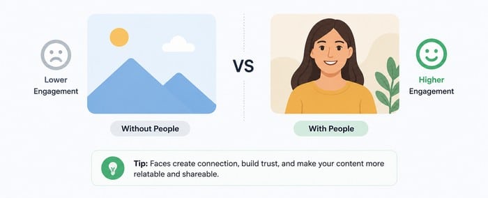
Images with human faces consistently perform better than images without people.
Studies show that visuals with faces can increase engagement by up to 38% (Georgia Institute of Technology).
Faces naturally draw our attention, helping posts stand out in busy social feeds and creating a stronger emotional connection with viewers.
Why does this happen? People instinctively relate to other people. A genuine smile, direct eye contact, or an authentic expression can make your content feel more personal, trustworthy, and relatable.
Instead of focusing only on products or graphics, include real people whenever it fits your message.
Try using:
- Smiling faces.
- Eye contact.
- Expressive emotions.
- Authentic lifestyle photography.Team members or customers instead of generic stock models.
If you run a business, consider featuring your employees, customers, or yourself. Original photography often feels more authentic than heavily staged stock images and can help build trust with your audience.
Even a subtle human presence can make your social media images more memorable and help increase engagement by encouraging people to stop scrolling and connect with your content.
Optimize Color Psychology
Colors influence emotions, perceptions, and even purchasing decisions. Choosing the right color palette can help reinforce your message and create a stronger connection with your audience.
While there are no strict rules, certain colors are commonly associated with specific feelings and are widely used in branding and marketing.
Here is a simple guide:
- Blue → trust and professionalism.
- Red → urgency and excitement.
- Green → growth and calmness.
- Yellow → optimism and energy.
- Black → luxury and authority.
When creating social media images, use colors consistently to strengthen your brand identity and make your content instantly recognizable.
Limiting your palette to two or three primary colors also helps create a clean, professional look without overwhelming the viewer.
Use Text Overlay Wisely
Text on images should support—not overwhelm—the visual. The image should remain the primary focus, while the text adds context and reinforces the message.
When too much text is added, the design can feel crowded and become difficult to read, especially on mobile devices.
Best practices:
- Keep it under 10–15 words.
- Use bold fonts for headlines.
- Avoid long sentences.
- Leave breathing space.
- Use a subtle shadow or overlay if the background is busy.
Before publishing, view the image at a smaller size to make sure the headline remains clear and readable. If viewers need to stop and concentrate to understand the text, the message is probably too long or too complex.
Compress Images Without Losing Quality
Large image files slow down loading times, especially on mobile.
This directly impacts engagement. If your images take too long to load, visitors may leave your page before the content is fully displayed.
Faster-loading images not only improve the user experience but can also support better search engine rankings by contributing to improved Core Web Vitals.
Use tools like:
Compression helps maintain quality while improving performance and speed.
Use AI Tools for Faster Design
AI tools are changing how social media images are created. They can help you generate ideas, remove backgrounds, resize graphics, create unique illustrations, and even design complete layouts in just a few minutes.
This allows you to spend less time on repetitive tasks and more time creating content that connects with your audience.
Top tools include:
These tools help generate layouts, backgrounds, and even full designs in seconds.
This saves time while still helping you boost engagement with professional visuals.
Use Calls to Action That Encourage Interaction
Many people enjoy your image but never engage because they are not invited to do so.
Include subtle calls to action such as:
- Save this post.
- Share with a friend.
- Leave a comment.
- Tell us your opinion.
- Tag someone who needs this.
- Learn more.
The best calls to action feel helpful rather than pushy.
Test Different Visual Styles
Not every audience reacts the same way. What performs well for one brand or platform may not deliver the same results for yours.
Experimenting with different visual styles helps you discover what captures your audience’s attention and encourages them to engage with your content.
Try:
- Minimalist designs.
- Bold typography layouts.
- Photo-based posts.
- Illustration-based visuals.
- Infographics.
- Carousel graphics.
Don’t be afraid to test different color schemes, image compositions, and calls to action as well. Review your social media analytics to identify patterns in likes, comments, shares, and click-through rates.
Over time, these insights will help you refine your design strategy and create awesome social media images.
Optimize for Mobile Viewing

More than 80% of social media usage happens on mobile devices (BroadbandSearch).
That means:
- Large fonts matter.
- Simple layouts matter.
- Vertical formats perform better.
- Always design for small screens first.
A design that looks great on a desktop screen may not provide the same experience on a smartphone.
By prioritizing mobile users from the beginning, you can improve readability, increase engagement, and ensure your visuals remain clear and effective on every screen size.
Keep Your Designs Simple
One of the biggest design mistakes is trying to fit too much information into a single image.
Think about how people use social media. They scroll quickly and often decide in a fraction of a second if a post deserves their attention.
A clean design with one clear message almost always performs better than a busy graphic packed with text, icons, and multiple calls to action.
Instead of asking yourself how much you can fit into an image, ask yourself what the single most important takeaway should be.
A simple design often includes:
- One strong headline.
- One main image.
- Plenty of white space.
- One clear call to action.
Minimalist designs are also easier to recognize, especially on mobile devices where screen space is limited.
Create Images That Tell a Story
Great social media images do more than look attractive—they tell a story.
People naturally connect with stories because they create emotion and curiosity.
For example, instead of simply posting a picture of a camera, show someone capturing a beautiful sunset. Instead of displaying a finished meal, show the cooking process or the happy family enjoying dinner together.
Storytelling helps people imagine themselves in the moment, making them more likely to stop scrolling and interact with your content.
Ask yourself:
- What emotion should this image create?
- What story does this image tell at a glance?
- What action do I want viewers to take next?
Even simple product images become more engaging when they show real-life situations.
Use Templates to Save Time
Creating every design from scratch takes time.
Templates help maintain a consistent brand while speeding up your workflow.
Most professional marketers build a library of templates for:
- Blog promotions.
- Quote graphics.
- Product announcements.
- Sales promotions.
- Testimonials.
- YouTube thumbnails.
- Instagram carousels.
- Facebook posts.
Good templates still allow room for creativity while keeping your brand recognizable.
Choose Fonts That Are Easy to Read
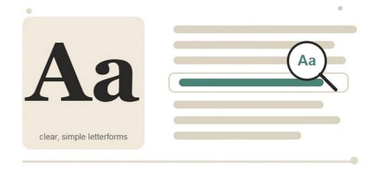
Typography can make or break your design.
Fancy fonts might look interesting, but they often become unreadable on smaller screens.
Stick with clean fonts that remain legible at any size.
Some excellent choices include:
- Montserrat
- Open Sans
- Poppins
- Roboto
- Lato
Limit yourself to one or two font families throughout your designs. Too many fonts make your content look inconsistent and unprofessional.
Also, pay attention to spacing. Good line spacing and generous margins improve readability.
Leave Plenty of White Space
White space, also called negative space, is simply the empty area around design elements.
It gives your content room to breathe.
Many beginners try to fill every empty corner with icons, text, or decorative shapes. Professional designers usually do the opposite.
White space helps viewers focus on what matters most.
Benefits include:
- Cleaner appearance.
- Better readability.
- Improved visual balance.
- Stronger emphasis on important elements.
Some of the world’s biggest brands, including Apple and Nike, rely heavily on white space in their marketing.
Use the Right Image Format
Choosing the correct file format affects image quality, loading speed, and overall appearance.
Here’s a simple comparison.
| Format | Best For | Advantages | Disadvantages |
| JPEG | Photos | Small file size, excellent compatibility. | No transparency, lossy compression. |
| PNG | Logos, graphics, screenshots. | Sharp quality, supports transparency. | Larger file sizes. |
| WebP | Modern web graphics. | Excellent compression and quality balance. | Older software may have limited support. |
| AVIF | High-quality images, modern websites, performance-focused platforms. | Superior compression, excellent image quality. | Limited support in older browsers and tools. |
| SVG | Icons, logos, illustrations. | Infinite scaling without quality loss, very lightweight. | Not suitable for complex photos, limited use in some social platforms. |
| GIF | Simple animations. | Widely supported, easy animations. | Limited color range, larger file size, lower quality. |
Which Image Format is Used Most?
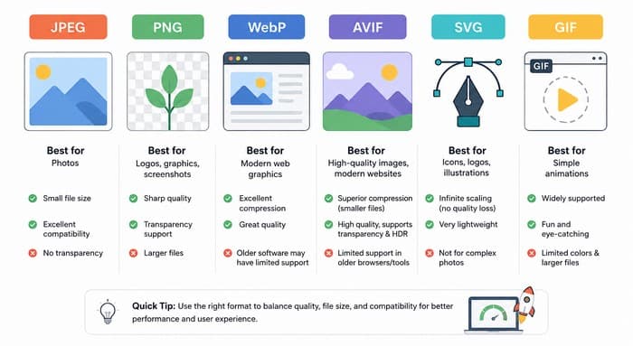
JPEG remains the most widely used image format across social media because it provides an excellent balance between image quality and file size.
PNG is the preferred choice for graphics containing logos, illustrations, transparent backgrounds, and screenshots.
WebP continues to grow in popularity, especially on websites, because it delivers excellent quality with much smaller file sizes. Some social platforms automatically convert uploaded optimized images into their own optimized formats.
Every social network has its own audience and preferred content style.
Instagram is highly visual.
Successful images usually feature:
- Bright colors.
- Minimal text.
- High-quality photography.
- Vertical layouts for Stories and Reels.
Facebook users interact well with:
- Lifestyle photography.
- Infographics.
- Blog graphics.
- Promotional visuals.
Images should immediately communicate the value of the post.
LinkedIn – Professional audiences appreciate:
- Clean graphics.
- Charts.
- Statistics.
- Industry insights.
- Professional photography.
Avoid overly flashy designs.
Pinterest works like a visual search engine.
Tall images perform exceptionally well because they occupy more screen space.
Popular content includes:
- Tutorials.
- Checklists.
- Step-by-step guides.
- Infographics.
X – Fast-moving conversations dominate X.
Simple graphics with bold headlines often outperform highly detailed designs because users scroll rapidly through their feeds.
Frequently Asked Questions (FAQ)
What are Social Media Images?
Social Media Images are visual graphics, photographs, illustrations, infographics, or branded designs created specifically for platforms such as Instagram, Facebook, LinkedIn, Pinterest, X, and TikTok.
They help capture attention, communicate information quickly, and encourage people to interact with your content.
Why are Social Media Images important?
Visual content attracts attention much faster than text alone. Well-designed Social Media Images can increase visibility, improve brand recognition, encourage shares and comments, and help boost engagement across multiple social media platforms.
What is the best image format for social media?
JPEG is the most commonly used format for photographs because it provides excellent image quality with relatively small file sizes. PNG is ideal for logos, graphics, and images requiring transparent backgrounds.
WebP is an excellent modern alternative that offers impressive compression while maintaining high visual quality, making it a great choice for websites and blogs.
What image size should I use for social media?
Each platform has recommended dimensions. Some of the most popular include:
- Instagram post: 1080 × 1080 pixels
- Instagram Story: 1080 × 1920 pixels
- Facebook post: 1200 × 630 pixels
- LinkedIn post: 1200 × 1200 pixels
- Pinterest Pin: 1000 × 1500 pixels
- X image: 1600 × 900 pixels
Using the recommended sizes helps your images appear sharp and professional.
How often should I update my social media design style?
Review your designs every few months to keep your content fresh and aligned with current trends. At the same time, maintain consistent brand colors, typography, and visual elements so your audience can easily recognize your content.
Conclusion
Creating better social media images is about much more than choosing attractive colors or adding eye-catching text. The most successful visuals combine thoughtful design, clear messaging, consistent branding, and a solid understanding of your audience.
When these elements work together, your content is far more likely to capture attention and boost engagement across every major social media platform.
Fortunately, you do not need years of design experience or expensive software to create professional-looking graphics. User-friendly tools like Canva, Adobe Express, Figma, Pixlr, and AI-powered image generators make it possible for anyone to produce high-quality visuals in less time.
Pair those tools with the tips in this guide on Pixwizify, and you’ll be well on your way to creating content that stands out in crowded social feeds.
Keep in mind that successful design is an ongoing process. Experiment with different layouts, colors, image formats, and calls to action, then review your analytics to discover what resonates most with your audience. Small improvements made consistently can lead to meaningful growth over time.
As social media continues to evolve, high-quality visuals will remain one of the most effective ways to connect with your audience, strengthen your brand, and increase your reach.
Start applying these proven techniques today, and you’ll be creating social media images that not only look professional but also help boost engagement and support your long-term marketing goals.