
Images are essential to modern websites. They make blog posts more engaging, explain complex ideas, showcase products, and help readers understand content faster. But poorly optimized images can also become one of the biggest causes of slow page loads.
A single large photograph can weigh several megabytes. Multiply that by several images on a page, and visitors may end up downloading far more data than necessary.
The good news is that image optimization does not have to be complicated. With a consistent workflow, an image can move from the original upload to a fast, responsive, accessible, and SEO-friendly web asset with only a few practical steps.
Our guide walks through the ultimate image optimization workflow, from choosing the right source image to resizing, compressing, converting, adding SEO information, publishing, and monitoring performance.
The goal is simple: keep images looking great while making them as efficient as possible.
Why Image Optimization Matters for SEO and Performance
Image optimization is much more than reducing file size.
Images influence page speed, user experience, accessibility, mobile performance, and image search visibility. Google specifically recommends using high-quality images while applying modern optimization and responsive-image techniques to provide a fast user experience.
Large images can also contribute significantly to page weight. This becomes particularly important when an image is part of the main content and contributes to Largest Contentful Paint (LCP).
A visitor on a fast desktop connection might barely notice the difference between a 500 KB image and a 3 MB image. Someone using a mobile connection can have a very different experience.
That is why a good workflow should optimize an image before and after it reaches the website.
Step 1: Start With the Right Image
Image optimization begins before compression.
Start with a high-quality source that fits the purpose of the page. A blurry photograph cannot be transformed into a genuinely sharp image simply by saving it in WebP or AVIF.
The original image should also be large enough for its intended display size, but not unnecessarily huge.
For example, uploading a 6000-pixel-wide photograph when the website displays it at around 1200 pixels wastes storage, processing power, and bandwidth.
The objective is not to upload the largest possible image.
The objective is to upload an image that provides enough detail for its actual use.
Step 2: Resize the Image Before Uploading
Resizing is one of the easiest ways to make a dramatic difference to image file size.
Suppose a blog’s main content area displays images at approximately 1000–1200 pixels wide. Uploading a 4000-pixel-wide image gives the browser a much larger file than it needs.
Resize the image close to the maximum dimensions required by the website.
For featured images, blog illustrations, product photographs, and screenshots, determine the maximum display width first. Then resize the original accordingly.
Tools such as Squoosh, Adobe Photoshop, Affinity Photo, and other image editors can handle this step.
A useful rule is:
Resize first, compress second.
There is little benefit in heavily compressing an enormous image when the image could have been made dramatically smaller through resizing.
Step 3: Choose the Right Image Format
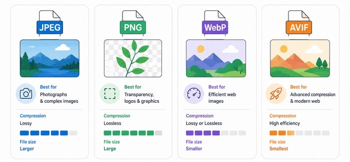
The next decision is the file format.
JPEG and PNG remain useful, but modern formats such as WebP and AVIF can often deliver smaller files while maintaining good visual quality. MDN identifies WebP as an excellent general-purpose choice and AVIF as a highly efficient modern format.
JPEG is still a practical choice for photographs and complex images.
It works particularly well when transparency is not required, and some lossy compression is acceptable.
PNG is useful when transparency, sharp edges, or lossless quality is important.
Logos, interface graphics, screenshots, and illustrations with large areas of flat color can sometimes work well as PNG files.
Still, PNG should not automatically be the default. WebP or AVIF may produce a considerably smaller result for many images.
WebP is now a strong default for many websites.
It supports both lossy and lossless compression and also supports transparency and animation. MDN notes that WebP images are generally smaller than visually similar JPEG and PNG files.
AVIF can provide even stronger compression than WebP in many situations.
It is particularly interesting for performance-focused websites, although format support and workflow considerations still make fallbacks useful. The <picture> element can be used to provide AVIF or WebP alongside a compatible fallback.
Recommended approach: Test WebP and AVIF rather than blindly converting every image to one format.
Step 4: Compress the Image
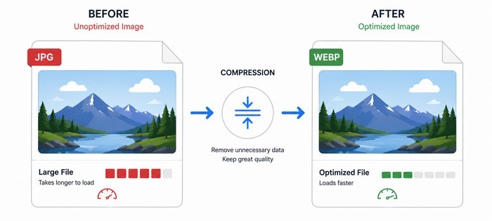
Once the dimensions and format are correct, compression comes next.
Compression removes unnecessary data from an image so the file requires less bandwidth.
There are two broad approaches: lossy and lossless compression.
Lossy compression can produce significantly smaller files by removing some image information. Lossless compression reduces file size without permanently discarding image information.
For most website photographs, carefully controlled lossy compression can provide an excellent balance between quality and performance.
The key word is carefully.
An image that has been compressed too aggressively may contain visible artifacts, muddy details, or ugly edges.
Several tools can help:
- Squoosh — useful for manual image compression and format conversion.
- TinyPNG — convenient for compressing common web image formats.
- ShortPixel — useful for WordPress image optimization.
- Imagify — WordPress-focused image compression and optimization.
- Optimole — combines image optimization with automatic delivery features.
A good workflow should always include a quick visual inspection after compression. Smaller is not automatically better if the image looks noticeably worse.
Step 5: Give the Image a Descriptive Filename
The optimization workflow should also include SEO.
Before uploading an image, replace generic filenames such as:
IMG_4587.jpg
with something meaningful, such as:
image-optimization-workflow.jpg
Google says descriptive filenames can provide useful clues about an image’s subject matter. Google also recommends short, descriptive filenames instead of generic names.
There is no need to turn the filename into a long keyword string.
Keep it simple and descriptive.
For example:
Good:wordpress-image-optimization.jpg
Less useful:IMG0002387.jpg
Avoid:wordpress-image-optimization-best-image-seo-compression-webp-images.jpg
The filename should describe the image naturally.
Step 6: Write Useful Alt Text
Alt text is one of the most important parts of an image SEO workflow.
It helps screen readers understand images and gives search engines additional context about what an image represents.
Google specifically recommends descriptive alt text and warns against keyword stuffing.
Consider an image showing someone compressing a large photograph.
A weak alt attribute might be:
alt="image optimization"
A more useful version would be:
alt="Person compressing a large photo before uploading it to a website"
The second version explains what is actually happening.
Do not force keywords into every alt attribute.
If an image is purely decorative and adds no meaningful information, an empty alt attribute can be appropriate.
The purpose is to describe the image for people who cannot see it, not to create an artificial ranking signal.
Step 7: Use Responsive Images
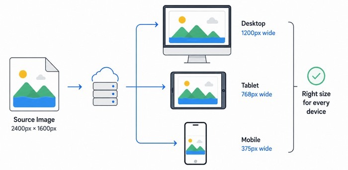
A 1200-pixel image does not necessarily need to be downloaded by every visitor.
A smartphone might display the image at 400 pixels wide, while a desktop monitor could display it at 1000 pixels.
Responsive images allow the browser to choose an appropriate image resource.
HTML provides tools such as srcset and sizes, while <picture> can provide different formats and image sources.
Google recommends responsive image techniques, including srcset and <picture>, and WordPress has supported responsive images using srcset and sizes since WordPress 4.4.
This is particularly useful for WordPress websites.
WordPress automatically generates multiple image sizes for uploaded images and can include responsive image information in the markup.
That means WordPress can often handle much of the technical work automatically.
Still, the original uploaded image needs to be sensible.
Responsive images cannot completely fix a workflow that starts with unnecessarily massive files.
Step 8: Consider Lazy Loading
Not every image needs to load immediately.
Images further down a long article can often wait until the visitor approaches them. This technique is called lazy loading.
Lazy loading can reduce the amount of content that needs to be downloaded during the initial page load.
However, the main image visible at the top of the page should be handled carefully. Automatically lazy-loading an important above-the-fold image can delay its appearance and potentially hurt perceived performance.
The goal is not simply to enable lazy loading everywhere.
The goal is to load important images quickly and defer less important images when appropriate.
Modern WordPress installations and performance plugins can handle many of these decisions automatically, but testing remains important.
Step 9: Set Image Dimensions to Reduce Layout Shifts
Images should have known dimensions so the browser can reserve the appropriate space before the file finishes loading.
This helps prevent content from suddenly moving down the page when an image appears.
That matters for Cumulative Layout Shift (CLS), one of Google’s Core Web Vitals.
For example, if an article contains a 1200 × 800 image, the browser should know those dimensions before the image finishes downloading.
A properly configured image can include:
width="1200" height="800"
Modern WordPress themes and image handling systems commonly provide dimensions automatically.
Still, it is worth checking the final page rather than assuming everything is configured correctly.
Step 10: Place Images Near Relevant Content
Image SEO is not isolated from the surrounding page.
Google explains that the text surrounding an image can help it understand the image’s subject and context.
Imagine an article about image compression.
An illustration showing a large file becoming a smaller file makes sense next to a section discussing compression.
Placing the same illustration randomly in an unrelated section provides less useful context.
The surrounding heading, paragraph, caption, filename, alt text, and page topic should work together naturally.
Think of the image and its surrounding content as a single information package.
Step 11: Optimize the Featured Image
Featured images deserve special attention because they can become some of the most important images on a page.
A featured image may appear:
- At the top of the article
- In blog archives
- In related-post sections
- In social media previews
- In search features
For social sharing, a common Open Graph image dimension is 1200 × 630 pixels.
Google also explains that publishers can indicate a preferred image through metadata such as og:image or Schema.org properties such as primaryImageOfPage.
This is especially useful for websites that publish articles regularly.
A strong featured image should be relevant, visually clear, appropriately sized, and optimized before publication.
Step 12: Use Image Sitemaps When Appropriate
Image SEO also involves discoverability.
Google supports image sitemaps as a way to provide information about images that Google might not otherwise discover easily.
An image sitemap can be particularly useful for large websites, image-heavy sites, or websites where images are delivered through more complex systems.
Many WordPress SEO plugins can assist with sitemap generation, reducing the amount of manual work required.
For most small sites, the priority should first be getting the fundamentals right: crawlable pages, accessible images, descriptive context, good markup, and strong performance.
Step 13: Test the Final Page
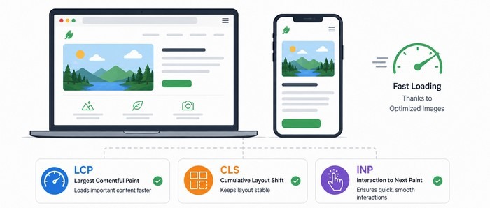
The workflow should not end when the image is uploaded.
The final page needs to be tested.
A page can look perfect inside the WordPress editor while behaving very differently on a real mobile device.
Use Google PageSpeed Insights to evaluate performance and identify image-related opportunities.
Also use Google Search Console to monitor search performance and indexing issues.
For technical image inspection, browser developer tools can reveal the actual image file being downloaded, its dimensions, format, and file size.
This is where problems often become obvious.
An image may look small on screen but still be loading a huge original file in the background.
A Simple Image Optimization Workflow
The entire process can be summarized as:
Choose → Resize → Format → Compress → Rename → Add Alt Text → Make Responsive → Optimize Loading → Publish → Test
The important part is consistency.
There is no need to reinvent the process every time a new article is published.
A repeatable workflow makes image optimization almost automatic.
For WordPress websites, a practical setup could combine WordPress’s native responsive-image functionality with a compression plugin such as ShortPixel or Imagify, while tools such as Squoosh can be used for manual optimization and experimentation.
WordPress’s responsive-image system provides srcset and sizes to help browsers select appropriate image resources.
Common Image Optimization Mistakes to Avoid
Even experienced website owners can fall into a few common traps.
One is uploading original camera images directly to your WordPress website. A modern smartphone can produce photographs that are several megabytes in size. Those files are rarely appropriate for direct web delivery.
Another mistake is using PNG for every image. PNG is excellent in the right situation, but photographs often benefit from JPEG, WebP, or AVIF.
Keyword stuffing alt text is another problem. Alt text should describe the image rather than repeat a target keyword several times.
It is also a mistake to focus exclusively on compression.
A 300 KB image is not automatically optimized if it is 4000 pixels wide and displayed at 700 pixels.
Dimensions, format, compression, delivery, accessibility, and context all matter.
Recommended Image Optimization Toolkit
A good toolkit does not need dozens of applications.
For manual work, Squoosh is an excellent starting point because it makes it easy to compare formats and compression settings.
For WordPress, ShortPixel, Imagify, and Optimole are worth considering for automated optimization and delivery.
For testing, PageSpeed Insights provides valuable performance information, while Google Search Console helps monitor search visibility and indexing.
For technical reference, Google Search Central’s Image SEO documentation is one of the best places to check Google’s current recommendations.
Final Image Optimization Checklist
Before publishing an image, take a quick look at the complete workflow.
Image Optimization Checklist
Source: Is the original image sharp and suitable for the page?
Dimensions: Has it been resized to a sensible maximum size?
Format: Is JPEG, PNG, WebP, AVIF, or SVG the most appropriate format?
Compression: Has unnecessary file data been removed?
Filename: Does the filename describe the image?
Alt text: Does the alt text accurately explain the image?
Responsive delivery: Can the browser receive an appropriately sized version?
Loading: Are non-critical images deferred appropriately?
Dimensions: Are image dimensions defined to help prevent layout shifts?
Context: Is the image placed near relevant content?
Featured image: Is the main image suitable for search and social sharing?
Testing: Has the final page been checked on desktop and mobile?
Conclusion: Make Image Optimization Part of the Publishing Process
Image optimization works best when it becomes part of the normal publishing workflow instead of something done after a website becomes slow.
Start with the right image. Resize it. Choose an efficient format. Compress it without destroying quality. Give it a descriptive filename and useful alt text.
Make sure responsive delivery is working. Handle important images carefully, defer less important ones, and test the finished page.
The result is more than a smaller image file.
A well-optimized image can contribute to a faster website, better user experience, stronger accessibility, improved image discoverability, and a more efficient SEO strategy.
Google explicitly connects image quality, discoverability, context, and performance with its image-search recommendations.
The best image workflow is therefore not about making every image as small as possible.
It is about finding the right balance between quality, file size, dimensions, accessibility, SEO, and performance.
Once that balance becomes part of the publishing routine, every new image has a better chance of arriving on the website ready to perform.
That is the real goal of image optimization: better images, faster pages, and a better experience for everyone.
Disclosure: We sometimes use affiliate links in our content. Some of the links in this post are “affiliate links.” This means if you click on the link and purchase the item, we will receive an affiliate commission. It helps our website keep running and allows us to offset our writing team’s costs. Thanks for your support.